TOTJO Circle... Lets get this decided...
Akkarin wrote: My post was about using it officially with our rank badges, you can be as artistic as you like, but just for example look at all the current badges.
Everyone is black and white and the Councillor one is gold because... we're somehow special? They should all be the same, Alex would call it jewelry and I would agree.
In official circumstances we ought to use the official symbol, if you want to use it in artistic circumstances then use it however you like.
I appreciate your very valid opinion.
But I disagree with it as much as is humanly possible on the basis of design and visibility. Firstly, the rank badges as they are work "well*", with the exception of the circle/star, because they currently involve a lot of dark-color-on-dark-color and light-color-on-light-color nonsense. Secondly, why shouldn't the Councillor badges use a different color? Presumably, you folks run the joint. What's the point in rank symbols at all if everyone needs to be "equal"? We're not. We're all at different stages of this path and have different jobs on it.
Furthermore, are the rank badges "official"? Do they exist anywhere outside "right under our avatar"? I don't think they do, which would make them a visual representation of rank, and not actual valid rank insignia. If it's not actual valid rank insignia, then it's most likely unofficial, which means that it doesn't really matter if it's "white-on-black" or "black-on-white" or "chartreuse-on-mauve", does it?
Seriously, these threads are like watching average people on a cooking show, and I'm sat here shouting at the screen trying to get my point across, but nobody cares because they're all dead set on the fact that anchovies go in everything. I love you guys, but you really, really, really hurt my brain sometimes by refusing to listen to anybody who has expertise in a field if they disagree with you. It's like watching C-Span.
* this is actually a complete lie. they don't work that well at all. At least not at lower ranks, where Novice-to-Apprentice all share variations of the same color, because that gets super confusing with no other distinguishing marks. In addition to the poor contrast choices. I'm not knocking whoever designed them originally, and I'm definitely not knocking Vesha's hi-res designs. But, seriously, people. What are we doing?
A.Div
IP | Apprentice | Seminary | Degree
AMA | Vlog | Meditation
Please Log in to join the conversation.
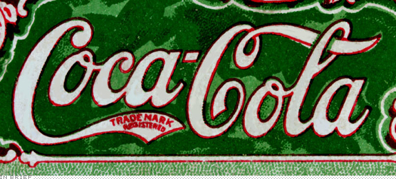
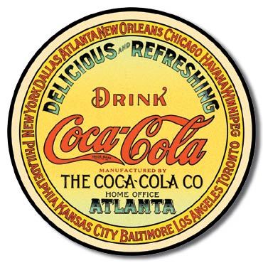
I never see a coca cola logo en green and yellow .... why?
Knight of Jediism
Ordained Deacon and Minister
Promoted and Ordained April 28, 2010
Please Log in to join the conversation.
-

- User
-

http://www.templeofthejediorder.org/component/content/article/40-information/698-rank-bars
Also just because something isn't written in documentation doesn't mean it isn't official. There are still quite a few 'unwritten rules' around TotJO and the FaQ still contains numerous errors in places (the Simple Oath article was the first of more changes I'll make to it).
@666
http://www.templeofthejediorder.org/faq#TotJOSymbol
That is our symbol. I didn't write anything more on it because we have the picture, nothing more needs to be said as they can see it. Perhaps one day we will document it (maybe in a book of liturgy when we next write another), but until then it should do the job.
Please Log in to join the conversation.
No, that's not right...
How about:
Maybe if I...
Or...
What if I Google...
Well, seems you're right. Apparently the Coca-Cola logo is always, always, always, white-on-red and never, ever changes. Ever.
A.Div
IP | Apprentice | Seminary | Degree
AMA | Vlog | Meditation
Please Log in to join the conversation.
Akkarin wrote: Rank bars:
http://www.templeofthejediorder.org/component/content/article/40-information/698-rank-bars
Also just because something isn't written in documentation doesn't mean it isn't official. There are still quite a few 'unwritten rules' around TotJO and the FaQ still contains numerous errors in places (the Simple Oath article was the first of more changes I'll make to it).
That doesn't make it more or less official. It's just a guideline to the pictures that pop up under our names. And in a purely online community, it's doubly important that "unwritten rules" are written down, because we're a global organization, and not everybody has the same base viewpoint coming into the Temple.
A.Div
IP | Apprentice | Seminary | Degree
AMA | Vlog | Meditation
Please Log in to join the conversation.
time to encourage the use of the real logo? maybe?, at lease in public places?
Knight of Jediism
Ordained Deacon and Minister
Promoted and Ordained April 28, 2010
Please Log in to join the conversation.
666 wrote: @ Akkarin, I know, some council members already told me that, and I do accept that as our logo, but for some reason, here is a now post about it, and the website, still have a wrong logo, (also in some other places... facebook, bla.. bla... bla...)
time to encourage the use of the real logo? maybe?, at lease in public places?
It's not wro..there is no rea...do you people understand how branding works, or should I just give the **** up and let you destroy the aesthetics of this gorgeous logo in peace?
edit - I apologize for the hostility in that post, but I don't understand why we don't take a moment to ask those of us that have had to deal with branding issues and graphic design and logo recognizability and heraldic function and contrast and negative space and ART and things what their opinion is, instead of all just harrumphing about "the way it ought to be"
A.Div
IP | Apprentice | Seminary | Degree
AMA | Vlog | Meditation
Please Log in to join the conversation.
- Posts: 14624
Hi steamboat...
We having fun?
Lol, OK, yes, we did agree thatbthe circle was officially a part...
I guess, my question is more "where is it officially needed?"
I also think 666's point was it doesn't change mid-campaign....
Yes, it changes, but, they do not officially use more than two versions at a time...
And even then, only in the transition form one to the other...
Rank bars, are official, page header, official....
Ecards sent out from TOTJO, official....
Ecards not sent out from TOTJO, such as posted by a member, unofficial...
Hows that?
Which means for the ecards, either mbets need to post them and tag TOTJO on Facebook/g+, or we need them with the official emblem too, to be posted officially...
On walk-about...
Sith ain't Evil...
Jedi ain't Saints....
"Bake or bake not. There is no fry" - Sean Ching
Rite: PureLand
Former Memeber of the TOTJO Council
Master: Jasper_Ward
Current Apprentices: Viskhard, DanWerts, Llama Su, Trisskar
Former Apprentices: Knight Learn_To_Know, Knight Edan, Knight Brenna, Knight Madhatter
Please Log in to join the conversation.
-

- User
-

...all of which are recognisably the same symbol, displayed in different ways. I appreciate the need to be clearer with the "official" usage, but I would say either the "star" or the "circle" are similarly identifiable... in some situations, one or the other looks better. Why limit ourselves?
As to colours, I agree they should be uniform if we're talking about stuff like rank bars, because otherwise it just looks a little messy, but beyond that also see no reason to restrict them further.
Just my 2c.
Please Log in to join the conversation.
A.Div
IP | Apprentice | Seminary | Degree
AMA | Vlog | Meditation
Please Log in to join the conversation.
-

- User
-

Jestor wrote: Ecards sent out from TOTJO, official....
Ecards not sent out from TOTJO, such as posted by a member, unofficial...
Hows that?
Which means for the ecards, either mbets need to post them and tag TOTJO on Facebook/g+, or we need them with the official emblem too, to be posted officially...
Not wishing to undermine... but:
To be honest I had considered the E-cards as 'art' and the ones that 'blend' the symbol into the picture itself I thought looked really good. I don't really view them as 'official' in the same way that our rank bars or front page symbols are 'official'. The e-cards in my view clearly come under the umbrella of art.
Please Log in to join the conversation.
Please Log in to join the conversation.
when or where we can use the real logo, and where we can use a work of art?
IMO, if you are representing totjo, you must use the real logo, ecards, must have the real logo, the website, documentation, business cards must have the real logo. every representation of totjo must be done with the real logo
an image I create inspired in the logo, I can post it anywhere, as a work of art, but is not representation of totjo, or is just for my use, or to show to the users here, not intended to be used as Public image.
a public image representing totjo, must have the real logo.
=====
this is my opnion, not representing anybody else than me
@steamboat28, like it or not, (like me) the logo exist, there was no contest to create a new logo, or there was no debate to improve it, change or modernize the logo, so we must use what is already there, if one day, totjo made a contest for a new logo, new design, update or whatever, we all can have ideas.... but till that day come.
the logo is there, it already exist, and nobody ask yet (officially) to be changed replaced, updated, or whatever.
anyway, we are all free to show up, new designs, new logos, new ideas... who knows, maybe you can create one, and everybody love it. and totjo swap logos.
again imo
Knight of Jediism
Ordained Deacon and Minister
Promoted and Ordained April 28, 2010
Please Log in to join the conversation.
-

- User
-

The e-cards are created by other members and we decide to post them to our facebook page. Perhaps if we include say "Created by member......" [picture] that would get around it and give an indication that there are actually people contributing elsewhere.
Saying someone else created it would not be official representation but the Temple appreciating their artistic talent.
Please Log in to join the conversation.
-

- User
-

steamboat28 wrote: Well, seems you're right. Apparently the Coca-Cola logo is always, always, always, white-on-red and never, ever changes. Ever.
Thanks for the sarcasm, but the Coca-Cola logo is a trademark. Since you seem to feel like you are the only expert here, let me be clear.
A trademark, trade mark, or trade-mark[1] is a recognizable sign, design or expression which identifies products or services of a particular source from those of others. The trademark owner can be an individual, business organization, or any legal entity. A trademark may be located on a package, a label, a voucher or on the product itself. For the sake of corporate identity trademarks are also being displayed on company buildings.
As someone who works in a marketing capacity for a worldwide media company with more lawyers than anything else, I can assure you that these things are taken very seriously. You can "graphic design" anything to death, but the trademark is specifically what is legally registered by an entity to separate it from competition.
If you want to see viciously guarded trademarks and copyrights, you only need to look to the National Football League in the U.S.
When TOTJO decides to trademark a logo, that will be the only official one whether we use it exclusively or not. It will be the only legally protected mark in the eyes of the law. Until then, it will remain a point of contention.
Coca-Cola can change the colors and designs in it's marketing, but that doesn't make the entire design a trademarked Coca-Cola logo.
When in doubt, look for the ®
Please Log in to join the conversation.
Senan wrote: ...long post...
Which is why, if you check the other thread I linked earlier, I requested TotJO to register the circle-less logo for trademark purposes as well as the "official" one. To provide them with versatility. #jussayin'
A.Div
IP | Apprentice | Seminary | Degree
AMA | Vlog | Meditation
Please Log in to join the conversation.
-

- User
-

steamboat28 wrote:
Senan wrote: ...long post...
Which is why, if you check the other thread I linked earlier, I requested TotJO to register the circle-less logo for trademark purposes as well as the "official" one. To provide them with versatility. #jussayin'
Our current trademark isn't registered.
Please Log in to join the conversation.
Br. John wrote: The US trademark filing fee is $800.00.
I'm putting that in my "Things to Donate Toward" list.
A.Div
IP | Apprentice | Seminary | Degree
AMA | Vlog | Meditation
Please Log in to join the conversation.
steamboat28 wrote:
Br. John wrote: The US trademark filing fee is $800.00.
I'm putting that in my "Things to Donate Toward" list.
We can and will honor specified donations and account for them. The only proviso is that if we were in danger of losing our domain or internet service special funds could be used if nothing else is available.
Founder of The Order
Please Log in to join the conversation.


