TOTJO Circle... Lets get this decided...
- steamboat28
-
- Offline
- Banned
-

- Si vis pacem, para bellum.
Br. John wrote: The US trademark filing fee is $800.00.
I'm putting that in my "Things to Donate Toward" list.
A.Div
IP | Apprentice | Seminary | Degree
AMA | Vlog | Meditation
Please Log in to join the conversation.


steamboat28 wrote:
Br. John wrote: The US trademark filing fee is $800.00.
I'm putting that in my "Things to Donate Toward" list.
We can and will honor specified donations and account for them. The only proviso is that if we were in danger of losing our domain or internet service special funds could be used if nothing else is available.
Founder of The Order
Please Log in to join the conversation.
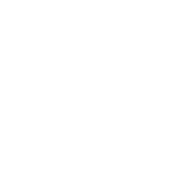
I personally find both symbols valid with their own intended purpose, and to use both would be appropriate considering the art of the Ecards and the unity they express and display... The nature of the force is expressed in the art of Ecards because the unity is in the art, the border of nature itself... We have the main symbol, with the circle, it is like the formal symbol, and then we have the informal symbol, E cards (art), etc... I would say they are both official... The one with the circle defines the group, the wholeness, completeness, etc... The one without, defines the individual, The relation of the subjective art and the interconnection of the symbol, and order...
Symbols always get misrepresented, or used and changed to fit a certain agenda... The cross for example, has been abused by Nazi Germany, the "iron cross" as it is called, and then christian groups began using it, unknown how it was affiliated... :woohoo: :sick:
That is my opinion, as I am no authority over the symbol, this is simply how I see it, and understand the symbol.
Please Log in to join the conversation.
Llama Su wrote: Symbols always get misrepresented, or used and changed to fit a certain agenda... The cross for example, has been abused by Nazi Germany, the "iron cross" as it is called, and then christian groups began using it, unknown how it was affiliated... :woohoo: :sick:
The Iron Cross is a military decoration of honor or valor. You can find it in medieval heraldry all over the place. It is not a symbol that earned its origins in Nazi Germany nor do I think it was Christian in origin as crosses were used before Christianity. As (if I remember right) the swastika isn't Nazi in origin either. Nazi Germany used the Iron Cross as it was intended.
But to keep this more on topic: I like the logo. I like it in the black-and-white. It's simple, it's recognizable, and it's meaningful. I'd say keep the circle. It's a symbol found in many religions in a meaningful way. I think it's a great device to contain the black.
Please Log in to join the conversation.
-

- Visitor
-

Kamizu wrote: The Iron Cross is a military decoration of honor or valor. You can find it in medieval heraldry all over the place. It is not a symbol that earned its origins in Nazi Germany nor do I think it was Christian in origin as crosses were used before Christianity. As (if I remember right) the swastika isn't Nazi in origin either. Nazi Germany used the Iron Cross as it was intended.
Absolutely correct. Even if I only look at Germany, the Iron cross was in use long before Nazism in the German military. It's origins lie with the Teutonic Knights of medieval times. The only addition the Nazis added was putting a swastika in the middle but even that isn't the case with all versions of that time period.
The swastika by the way is an ancient symbol in many cultures and represents the sun or the circle of life. It can still be found today for example in a lot of Buddhist temples (for example in Tibet). It's darkly ironic that Hitler used a symbol of light to bring so much death and destruction into the world.
(Sorry for the off-topic)
Please Log in to join the conversation.
I also am impressed with and agree with Master Akkarin`s point out this unity being further demonstrated by the bars having the same coloured symbol. This is not about esthetics but about unity and what we represent. I whole heartedly disagree with changing it and agree that this symbol be unified in the bars.
MTFBWY all.
The author of the TOTJO simple and solemn oath, the liturgy book, holy days, the FAQ and the Canon Law. Ordinant of GM Mark and Master Jestor.
Please Log in to join the conversation.
- steamboat28
-
- Offline
- Banned
-
- Si vis pacem, para bellum.
Nobody's talking about changing it. We're just arguing over what it currently is.Jon wrote: I personally see no reason to change the symbol
If it's not at least a little about aesthetics, then you're never ever going to have a good logo. Lots of people make logos every day that "represent" them with no thought to aesthetics, and it winds up looking terrible.Jon wrote: This is not about esthetics but about unity and what we represent.
A.Div
IP | Apprentice | Seminary | Degree
AMA | Vlog | Meditation
Please Log in to join the conversation.
Jestor wrote: This post made in the other thread, but I copy/pasted, so as to not derail the thread, and take away from the art...
Forgive the confusion...
Akkarin wrote: One of my pet annoyances with the Councillor badge is that it has a different central colour for the TotJO symbol than the rest - the colours are white and black for a reason
Having the symbol the same is unifying in my view so that's all that I would change
Wonderful work though!
Does the circle matter?
lol...
I said it did in the other thread about the symbol, when we started with the ecards...
Others said 'no'...
So, perhaps council needs to define it, as to whether the circle must be included...
Right now, in these designs (I feel like an art critic missing the point of the art, and instead, focusing too much on the symbols shown, lol) show the black outline, and then the 'background bleeds through the center of the star (most of them do, I dont think the councillor does)
Basically, if the 'black and white matter, then I request we use it everywhere, starting with the symbol at the top of our page....
But, lets hear from everyone before we take it to Council...
")

If it not about changing it Steam boat then please explain to me what Master Jestor is proposing. I am always open to understanding, please explain? May be it is not about aesthetics because we already have a good logo?
The author of the TOTJO simple and solemn oath, the liturgy book, holy days, the FAQ and the Canon Law. Ordinant of GM Mark and Master Jestor.
Please Log in to join the conversation.

- steamboat28
-
- Offline
- Banned
-
- Si vis pacem, para bellum.
Jon wrote: If it not about changing it Steam boat then please explain to me what Master Jestor is proposing. I am always open to understanding, please explain? May be it is not about aesthetics because we already have a good logo?
Jestor was discussing Akkarin's belief that the symbol for official uses should always be black-and-white and always have the circle, at least in regards to the badges. With which I wholly and vehemently disagree, which lead to a (second) discussion on what the symbol actually is, at its core, with people saying it's totally invalid if it doesn't have the circle, or it's not black and white, or whatever.
All of which are a serious cramp on artistic and aesthetic versatility, and really, don't do anything extra to reinforce the meaning of the logo. But w/e.
A.Div
IP | Apprentice | Seminary | Degree
AMA | Vlog | Meditation
Please Log in to join the conversation.