- Posts: 14624
TOTJO Circle... Lets get this decided...
- Jestor
-
 Topic Author
- Offline
- Administrator
-

Registered
- What you want to learn, determines your teacher ..
Less
More
10 years 2 months ago #137792
by Jestor
On walk-about...
Sith ain't Evil...
Jedi ain't Saints....
"Bake or bake not. There is no fry" - Sean Ching
Rite: PureLand
Former Memeber of the TOTJO Council
Master: Jasper_Ward
Current Apprentices: Viskhard, DanWerts, Llama Su, Trisskar
Former Apprentices: Knight Learn_To_Know, Knight Edan, Knight Brenna, Knight Madhatter
TOTJO Circle... Lets get this decided... was created by Jestor
This post made in the other thread, but I copy/pasted, so as to not derail the thread, and take away from the art...")
Forgive the confusion...
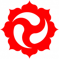
Does the circle matter?
lol...
I said it did in the other thread about the symbol, when we started with the ecards...
Others said 'no'...
So, perhaps council needs to define it, as to whether the circle must be included...
Right now, in these designs (I feel like an art critic missing the point of the art, and instead, focusing too much on the symbols shown, lol) show the black outline, and then the 'background bleeds through the center of the star (most of them do, I dont think the councillor does)
Basically, if the 'black and white matter, then I request we use it everywhere, starting with the symbol at the top of our page....
But, lets hear from everyone before we take it to Council...
Forgive the confusion...
Akkarin wrote: One of my pet annoyances with the Councillor badge is that it has a different central colour for the TotJO symbol than the rest - the colours are white and black for a reason
Having the symbol the same is unifying in my view so that's all that I would change
Wonderful work though!

Does the circle matter?
lol...
I said it did in the other thread about the symbol, when we started with the ecards...
Others said 'no'...
So, perhaps council needs to define it, as to whether the circle must be included...
Right now, in these designs (I feel like an art critic missing the point of the art, and instead, focusing too much on the symbols shown, lol) show the black outline, and then the 'background bleeds through the center of the star (most of them do, I dont think the councillor does)
Basically, if the 'black and white matter, then I request we use it everywhere, starting with the symbol at the top of our page....
But, lets hear from everyone before we take it to Council...
On walk-about...
Sith ain't Evil...
Jedi ain't Saints....
"Bake or bake not. There is no fry" - Sean Ching
Rite: PureLand
Former Memeber of the TOTJO Council
Master: Jasper_Ward
Current Apprentices: Viskhard, DanWerts, Llama Su, Trisskar
Former Apprentices: Knight Learn_To_Know, Knight Edan, Knight Brenna, Knight Madhatter
Please Log in to join the conversation.

10 years 2 months ago #137794
by MCSH
Master: Wescli Wardest
Clerical Mentor : Master Jestor
Rank: Apprentice
Clerical Rank: Licensed Minister

Replied by MCSH on topic TOTJO Circle... Lets get this decided...
Although as you said it is an art, but it is representing something... I suggest we change the symbol colors where we could to black and white.
Master: Wescli Wardest
Clerical Mentor : Master Jestor
Rank: Apprentice
Clerical Rank: Licensed Minister
Please Log in to join the conversation.
- steamboat28
-
- Offline
- User
-

Inactive
- Si vis pacem, para bellum.
10 years 2 months ago - 10 years 2 months ago #137795
by steamboat28
A.Div
IP | Apprentice | Seminary | Degree
AMA | Vlog | Meditation
Replied by steamboat28 on topic TOTJO Circle... Lets get this decided...
Didn't we already have a thread about this?
And didn't we decide that the circle is considered part of the original design, but that artistic expression is perfectly valid because it keeps the damn thing from looking so$@#$^@ing boring all the time?
And didn't I spend about fi'ty-'levem posts on how the design itself is actually monochrome with negative space, and not white stars on a black background? Y'know, because the FAQ explanation says "dark and light" and not "black and white"?
...I could've sworn we talked about this before...deja vu, man. :whistle:
A.Div
IP | Apprentice | Seminary | Degree
AMA | Vlog | Meditation
Last edit: 10 years 2 months ago by steamboat28.
The following user(s) said Thank You: Zenchi
Please Log in to join the conversation.
-

- Visitor
-
Public
10 years 2 months ago - 10 years 2 months ago #137799
by
Replied by on topic TOTJO Circle... Lets get this decided...
My post was about using it officially with our rank badges, you can be as artistic as you like, but just for example look at all the current badges.
Everyone is black and white and the Councillor one is gold because... we're somehow special? They should all be the same, Alex would call it jewelry and I would agree.
In official circumstances we ought to use the official symbol, if you want to use it in artistic circumstances then use it however you like.
Last edit: 10 years 2 months ago by .
Please Log in to join the conversation.
-
- Visitor
-
Public
10 years 2 months ago #137801
by
Replied by on topic TOTJO Circle... Lets get this decided...
But, it's so glamorous and pretteh! :lol:
Please Log in to join the conversation.

10 years 2 months ago - 10 years 2 months ago #137802
by 666
Knight of Jediism
Ordained Deacon and Minister
Promoted and Ordained April 28, 2010
Replied by 666 on topic TOTJO Circle... Lets get this decided...
I ask long time ago, and re ask, just a couple of weeks ago.
the old answer, was like the new, the circle MUST be there.
in my opinion, was part of the logo, was part of the so named balance between light and dark. so even colors matter.
in the other hand, the logo must be registered somewhere, as trademark, or as company logo, or whatever, so must be a legal aspect of it.
other than that, is not a good idea to have more than one logo.
a logo is a sign, is a representation, an identification and for me, was with the circle.
the most important thing is... UNIFICATION, if need to be there, we need to push it, and use it, everywhere.
if not, we need to remove it and use the main (new) logo (without circle)
and if we talk about inspirational art, ... well, we can use it, in any way, because was just something made, inspired in the logo ( like the gold one I've made years ago) but, never intended to be used as LOGO, just a work of art.
art is art, legal aspect, or identity is something different.
and please, the description in the meaning of the logo is so open, that, we can not base our decision on it.
this are all made following what the web say about the logo


clearly is not our logo, or is not the one I chose to represent me
so to be clear in my opinion.
1- we need one and only one logo as identity, as representation of members here
2- the circle make the black color end somewhere, ( light/dark)
3- without the circle, there is only a white start inside, with a white star shape outside.
without the circle, is a more versatile image, but doesn't represent everything.
in symbols, black and white represent light and dark, NO other colors, nor blue, nor yellow, nor red nor green, even when the different colors shades can make it look like a dark color, and a light one.
the right ones are black and white. without the circle, there is only ONE color.... WHITE, no other.
how do you represent dark and light with only WHITE? is that possible - NO
so we need another color.... and we need that color to graphically end somewhere... the black circle made that
so if is me , with the circle is the right one.
and I forgot to say, in any public website we post facebook, tweeter, youtube, mom's website, or any, we MUST use our main logo, no other.
think, we are not as recognized as i.e. coca cola, and this big companies, don't change the logo every decade. this is why they are well know logos.
we are not well know, and worst, if we start using different logos.
my proposition is the council or whoever deside this, need to make us use the real main logo, everywhere, and keep the inspirational art, just like that... art, not representation of all of us.
the old answer, was like the new, the circle MUST be there.
in my opinion, was part of the logo, was part of the so named balance between light and dark. so even colors matter.
in the other hand, the logo must be registered somewhere, as trademark, or as company logo, or whatever, so must be a legal aspect of it.
other than that, is not a good idea to have more than one logo.
a logo is a sign, is a representation, an identification and for me, was with the circle.
the most important thing is... UNIFICATION, if need to be there, we need to push it, and use it, everywhere.
if not, we need to remove it and use the main (new) logo (without circle)
and if we talk about inspirational art, ... well, we can use it, in any way, because was just something made, inspired in the logo ( like the gold one I've made years ago) but, never intended to be used as LOGO, just a work of art.
art is art, legal aspect, or identity is something different.
and please, the description in the meaning of the logo is so open, that, we can not base our decision on it.
this are all made following what the web say about the logo
clearly is not our logo, or is not the one I chose to represent me
so to be clear in my opinion.
1- we need one and only one logo as identity, as representation of members here
2- the circle make the black color end somewhere, ( light/dark)
3- without the circle, there is only a white start inside, with a white star shape outside.
without the circle, is a more versatile image, but doesn't represent everything.
in symbols, black and white represent light and dark, NO other colors, nor blue, nor yellow, nor red nor green, even when the different colors shades can make it look like a dark color, and a light one.
the right ones are black and white. without the circle, there is only ONE color.... WHITE, no other.
how do you represent dark and light with only WHITE? is that possible - NO
so we need another color.... and we need that color to graphically end somewhere... the black circle made that
so if is me , with the circle is the right one.
and I forgot to say, in any public website we post facebook, tweeter, youtube, mom's website, or any, we MUST use our main logo, no other.
think, we are not as recognized as i.e. coca cola, and this big companies, don't change the logo every decade. this is why they are well know logos.
we are not well know, and worst, if we start using different logos.
my proposition is the council or whoever deside this, need to make us use the real main logo, everywhere, and keep the inspirational art, just like that... art, not representation of all of us.
Knight of Jediism
Ordained Deacon and Minister
Promoted and Ordained April 28, 2010
Last edit: 10 years 2 months ago by 666.
The following user(s) said Thank You: Alexandre Orion
Please Log in to join the conversation.
- steamboat28
-
- Offline
- User
-
Inactive
- Si vis pacem, para bellum.
10 years 2 months ago - 10 years 2 months ago #137803
by steamboat28
I appreciate your very valid opinion.
But I disagree with it as much as is humanly possible on the basis of design and visibility. Firstly, the rank badges as they are work "well*", with the exception of the circle/star, because they currently involve a lot of dark-color-on-dark-color and light-color-on-light-color nonsense. Secondly, why shouldn't the Councillor badges use a different color? Presumably, you folks run the joint. What's the point in rank symbols at all if everyone needs to be "equal"? We're not. We're all at different stages of this path and have different jobs on it.
Furthermore, are the rank badges "official"? Do they exist anywhere outside "right under our avatar"? I don't think they do, which would make them a visual representation of rank, and not actual valid rank insignia. If it's not actual valid rank insignia, then it's most likely unofficial, which means that it doesn't really matter if it's "white-on-black" or "black-on-white" or "chartreuse-on-mauve", does it?
Seriously, these threads are like watching average people on a cooking show, and I'm sat here shouting at the screen trying to get my point across, but nobody cares because they're all dead set on the fact that anchovies go in everything. I love you guys, but you really, really, really hurt my brain sometimes by refusing to listen to anybody who has expertise in a field if they disagree with you. It's like watching C-Span.
* this is actually a complete lie. they don't work that well at all. At least not at lower ranks, where Novice-to-Apprentice all share variations of the same color, because that gets super confusing with no other distinguishing marks. In addition to the poor contrast choices. I'm not knocking whoever designed them originally, and I'm definitely not knocking Vesha's hi-res designs. But, seriously, people. What are we doing?
A.Div
IP | Apprentice | Seminary | Degree
AMA | Vlog | Meditation
Replied by steamboat28 on topic TOTJO Circle... Lets get this decided...
Akkarin wrote: My post was about using it officially with our rank badges, you can be as artistic as you like, but just for example look at all the current badges.
Everyone is black and white and the Councillor one is gold because... we're somehow special? They should all be the same, Alex would call it jewelry and I would agree.
In official circumstances we ought to use the official symbol, if you want to use it in artistic circumstances then use it however you like.
I appreciate your very valid opinion.
But I disagree with it as much as is humanly possible on the basis of design and visibility. Firstly, the rank badges as they are work "well*", with the exception of the circle/star, because they currently involve a lot of dark-color-on-dark-color and light-color-on-light-color nonsense. Secondly, why shouldn't the Councillor badges use a different color? Presumably, you folks run the joint. What's the point in rank symbols at all if everyone needs to be "equal"? We're not. We're all at different stages of this path and have different jobs on it.
Furthermore, are the rank badges "official"? Do they exist anywhere outside "right under our avatar"? I don't think they do, which would make them a visual representation of rank, and not actual valid rank insignia. If it's not actual valid rank insignia, then it's most likely unofficial, which means that it doesn't really matter if it's "white-on-black" or "black-on-white" or "chartreuse-on-mauve", does it?
Seriously, these threads are like watching average people on a cooking show, and I'm sat here shouting at the screen trying to get my point across, but nobody cares because they're all dead set on the fact that anchovies go in everything. I love you guys, but you really, really, really hurt my brain sometimes by refusing to listen to anybody who has expertise in a field if they disagree with you. It's like watching C-Span.
* this is actually a complete lie. they don't work that well at all. At least not at lower ranks, where Novice-to-Apprentice all share variations of the same color, because that gets super confusing with no other distinguishing marks. In addition to the poor contrast choices. I'm not knocking whoever designed them originally, and I'm definitely not knocking Vesha's hi-res designs. But, seriously, people. What are we doing?
A.Div
IP | Apprentice | Seminary | Degree
AMA | Vlog | Meditation
Last edit: 10 years 2 months ago by steamboat28.
The following user(s) said Thank You: , Zenchi
Please Log in to join the conversation.
10 years 2 months ago #137804
by 666
Knight of Jediism
Ordained Deacon and Minister
Promoted and Ordained April 28, 2010
Replied by 666 on topic TOTJO Circle... Lets get this decided...
we are talking about the budgets or about the logo and the identity?
I never see a coca cola logo en green and yellow .... why?
I never see a coca cola logo en green and yellow .... why?
Knight of Jediism
Ordained Deacon and Minister
Promoted and Ordained April 28, 2010
The following user(s) said Thank You: MCSH
Please Log in to join the conversation.
-
- Visitor
-
Public
10 years 2 months ago #137805
by
Replied by on topic TOTJO Circle... Lets get this decided...
Rank bars:
http://www.templeofthejediorder.org/component/content/article/40-information/698-rank-bars
Also just because something isn't written in documentation doesn't mean it isn't official. There are still quite a few 'unwritten rules' around TotJO and the FaQ still contains numerous errors in places (the Simple Oath article was the first of more changes I'll make to it).
@666
http://www.templeofthejediorder.org/faq#TotJOSymbol
That is our symbol. I didn't write anything more on it because we have the picture, nothing more needs to be said as they can see it. Perhaps one day we will document it (maybe in a book of liturgy when we next write another), but until then it should do the job.
Please Log in to join the conversation.
- steamboat28
-
- Offline
- User
-
Inactive
- Si vis pacem, para bellum.
10 years 2 months ago - 10 years 2 months ago #137807
by steamboat28
A.Div
IP | Apprentice | Seminary | Degree
AMA | Vlog | Meditation
Replied by steamboat28 on topic TOTJO Circle... Lets get this decided...
Really? Hm. Let's see what I can find...
No, that's not right...
How about:

Maybe if I...
Or...

What if I Google...
Well, seems you're right. Apparently the Coca-Cola logo is always, always, always, white-on-red and never, ever changes. Ever.
Warning: Spoiler!
No, that's not right...
How about:
Warning: Spoiler!
Maybe if I...
Warning: Spoiler!
Or...
Warning: Spoiler!
What if I Google...
Warning: Spoiler!
Well, seems you're right. Apparently the Coca-Cola logo is always, always, always, white-on-red and never, ever changes. Ever.
A.Div
IP | Apprentice | Seminary | Degree
AMA | Vlog | Meditation
Last edit: 10 years 2 months ago by steamboat28.
The following user(s) said Thank You: , Zenchi
Please Log in to join the conversation.